Neuroimaging Methods

Neuroscience is a new field driven by technological advances that are of mutual importance to the medical, health and science technology sectors and they are impacting on humanity in nearly every way imaginable.


As scientific knowledge becomes increasingly accessible, closer scrutiny of techniques allows researchers to clarify and validate the quality of research used to inform legislation and medical best practice. It is an inevitability of the scientific process that subsequent research may negate historical precedent, and it turns out that numerous domains of neuroscience are marred by publication bias – especially true for neuroimaging of complex psychological conditions.

To explain this, let’s look at some early computational theories of the brain and then see how similar concepts are utilized within neuroimaging software used to quantify data. With this information we can explain where previous research may have misrepresented findings, also how better methods can be applied moving forward.

An influential model is the Sparse Distributed Memory, where brain activity is represented topologically, similar to a 2 dimensional checker board, where each grid square represents neurons in an area that either have or haven’t fired, rather like an I/O binary switch where black indicates some minimal threshold signal, I: this may seem simplistic, but it turns out to be rather accurate – and ‘bottom-up’ visual processing is in fact topological as light enters the retina, through to the optic fibers feeding information forward to higher cognitive processes:

Sparse Memory..jpg

In this example: a sparse matrix where 20% of the pattern is a random noise and the signal can still be inferred through some residual error.

On the other hand, given sufficient noise a true signal may be mis-inferred or reconstructed to other mental representations:

Images: Rogers, 1988. See also Pentti Kanerva, 1988

Images: Rogers, 1988. See also Pentti Kanerva, 1988

These concepts are also compatible to computational language theory, eg TRACE word retrieval, priming and Chomskyan Language Acquisition, highly influential to the fields of psychology and neuroscience, simplified into graphemes or phonemes for example:

Adaptive Switching Circuits_Early Training Algorithms.png

Image: Widrow & Hoff, 1960


Signal:Noise signal ratio is the essential concept for statistical analysis of neurological processes defined by the simple equation:


Outcome = Model + Error


Furthermore dopaminergic processes which are central to psychological states and addictive systems can be derived from this formula and simplified into the Reward Prediction Error Model:

λ−V


Dopamine response = reward occurred – reward predicted.[1]


[1] Common Addictive substances including alcohol are described by the Rescorla-Wagner Learning Rule for Pavlovian Conditioning (Rescorla & Wagner, 1972). Where Lamda is the maximum conditioned limit of learning and V represents changes in associative strength. Key to this aspect of conditioned learning is that it is not due to the co-occurrence of the Conditioned Stimulus to the Unconditioned Stimulus, but due to the unanticipated strength of the occurrence which indicated sensitivity of the (dopamine) receptors. It is the error in prediction that results in a stronger neural response, followed by neural strengthening.


The same is true for colour processing and digital neuroimaging, following the biological limits of human visual processing and thresholds for Just Noticeable Difference according to scale and differentiable stimuli (i.e. color wavelength).  

Colour Noise

Fourier Analysis is one method for separating wavelengths of varying frequencies, similar to how a signal or color is proverbially extracted from random noise – like static streaming on a TV that is turned on.

Imaging software can produce the same outcome by defining each point in the colour space with a number that can be defined within a range or distance to other colors within 3-dimensional vector space. Following on from that, a value can be defined from an image within a certain range, such as Blue RGB (R:18, G:78, B:230) ± 5, 10 or 15 pixels for example.

Delta - Just Noticeable Difference.jpg


Why does this matter? Well, there are a few reasons.


First of all, it demonstrates the limits of human processing that necessitate algorithmic training and digital processing used on images to best infer findings in the first place.

Secondly, because spatial mappings of colors in vector space allow us to code The data in various forms such as linear matrices, to better represent complex patterns that could reveal latent morphological trends hidden in what otherwise appears as a slight, visual randomness.

It is furthermore important for applying threshold limits correctly to the data, rather than according to your subjective aesthetic – which is probably even highly prone to bias with respect to how biased they are considered to be!

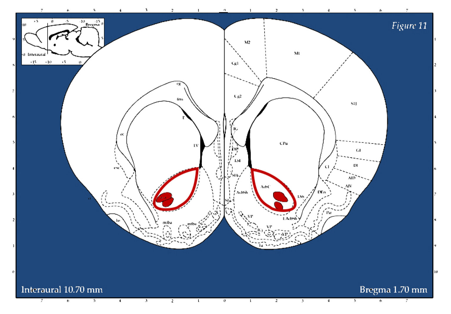
Now let’s consider this information in the context of some research conducted on rats last year, where neural tissue was tagged with a marker to identify activation patterns following exposure to alcohol:

NAcSH.jpg

The dark rectangle in the image above is the Nucleus Accumbens Shell, NAcSH region where microphotographs were taken.

(Magnify with mouse)

Above this, an algorithm of uniform distributed noise has been overlayed at increasingly high values in order to determine what the best threshold should be for defining constituted selectable pixel area. Extraneous noise impacts spatial distributions of colourspace. It follows from that, even slight additions of noise can add a considerable falsification to the spatial distribution.

Looking more closely at this now, it is apparent that raw images are needed and they should be taken in a standardised format in order to make inferences.

(Magnify with mouse)

Image top left shows raw microscope file, top right with contrast filter, polarizing extreme values. Bottom left shows thresholding algorithm picking up on tagged nuclei, bright red. Bottom right shows defined regions are ranked/ordered by number.


In this instance, neural counting is based on a defined parameter of what is considered dark pixel space to define and tag a boundary area. Therefore tagging can be arbitrary according to both how closely defined the space must adhere to sphericity as well as what is the limit of diameter in the spherical space. The lower right image identified elements are tagged with a numerical code that can be extracted along with its coordinates and pixel properties into a spreadsheet, where presumably they can be used, in more comprehensive calculated procedures.

Therefore thresholding is not arbitrary to the process of neural analysis and can in fact alter data findings if not adequately defined to prevent image extortion.  


Consider for example if photos varied in lighting and contrast due to inevitable smudging on the slides, they would need to be adjusted to be standardized, and some images would have more data clipped than others would.

Ultimately, this means that findings can turn out to be ‘significant’ or ‘not significant’ depending on what level the threshold has been set to.

Neural Data Results Graphs.png

Data trends can be sufficiently and systematically skewed from these sorts of applications of included-excluded parameters, for example if they coincide with particular regions of interest in the brain and reverse inferences (logical fallacy) are concluded from that, which turns out to happen often in medical neuroimaging publications.

So. Looking at this again more closely, an approach could be as follows:

In an instance such as this where regions within a neuroimage of sorts are being quantified according to a thresholding parameter based within a colorspace, the correct application should first be determined. While manual threshold can be defined based on a test run and then set across all images in a set, it is likely that Automated thresholding is preferable for a number of reasons: Automated thresholds are based on predefined algorithms that have been formulated based on some meta-analysis of pixel and texture properties for the images in question. They are therefore also standardised and may be better compared with other findings and are suitable for meta-analysis where best-practise method has been agreed upon.

Following that rationale, the optimal Automated threshold can be chosen according to some standards such as how a background is classified, and whether a local or global thresholding technique has been defined in that technique. Background can be subject to clamping effects too, where a given range of tones were expressed but get totally blocked out.  

A reductive but accurate explanation of pixel sampling is best described as a selection process where the local mean intensity of neighboring pixel boundaries for binary greyscale mapping based are derived based on a lowest-order sample value. Nearest Neighbour Sampling can be thought of as a process of pixel sampling based on inferences of proximity, where the process can be used for reductive purposes – downsampling, or for low-fidelity image purposes, or to ‘smooth out’ degraded images through extrapolating in more pixels to construct a high-fidelity image.

Nearest Neighbor Interpolation.jpg

Knowing this, a number of Auto thresholds can be tested first, to asses which will have the closest values and smallest standard deviation to an optimal – but not standardised manual threshold check. Essentially, the algorithms tag neighbouring pixels according to slightly different patterns and degrees of freedom, where some will be more optimal for blocking out the background.

High fidelity images are therefore important because they have a greater bit-depth range, e.g. 8-bit (28 = 256) pixel depth range and medical imaging applications often require over 10 or 12-bit sampling as a standard to reduce rounding errors in computations and extraneous compression factors, that may possibly misrepresent results.

Bit Range.jpg

Such images could be reprocessed as 16-bit (816 = 65,536) pixel depth range to ensure that no algorithmic misreadings occurred, as it can’t be precluded that
thresholding algorithms could vary accordingly by automated counts.

Based on this understanding of preliminary image analysis, we may look more closely at a range of statistical possibilities for data inferences. For example to examine classified pixel groups, or for higher dimensional clustering and pattern regressions in ‘broad spectrum’ pattern data sets where there may be latent subgroupings. Shape analysis can be defined more clearly in the colorspace to compare topological differences between groups such as age and sex, where again, looking for patterns.


Spectral composition is especially important in ‘noisy signal images’ where some Tones are algorithmically excluded but may have been legitimate and therefore reduced the total – and relative count of included elements.

A final point of interest would be to consider Principal Component Analysis in the context of neuroimaging, given the points already made. It may be the case that factor groupings of various elements may vary or overlap depending on how thresholding has saturated pixels, where it is possible that some ranges or texture components are not uniformly classified.

Current research: The interest for all of this is to apply best practise imaging analysis and digital accessibility standards to the field of neuroscience and digital neuroimaging within the broader context of scientific accessibility and veracity.

This is especially important in such a burgeoning field where various conflicts of findings and methodologies are expected and clear communication of theory and outcomes are indispensable . The applications discussed here extend further into human neuroimaging applications like MRI, CAT and PET imaging, emphasising that simple oversights can turn out to be nontrivial Visual science in all of its forms are perhaps the most accessible medium for conveying information succinctly, underscoring emphasis to patients seeking insight for their various states and neurological conditions.

Finally, the outcome from all of this would be to achieve reliable, valid & exacting findings — as well as certified top cream science.


References


Kanerva, P. (1988). Sparse Distributed Memory. MIT Press.

Rogers, D. (1988) Kanverva's Sparse Distributed Memory: An Associative Memory Algorithm well-suited to the Connection Machine. RIACS Technical Report 88.32, Research Institute for Advanced Computer Science NASA Ames Research Center.

Widrow, B., Hoff, M.E. (1960). Adaptive Switching Circuits. Office of Naval Research Centre: Stanford Electronics Laboratories. Technical Report No. 1553-1.

Rescorla, R. A., & Wagner, A. R. (1972). A theory of Pavlovian conditioning: Variations in the associability of stimuli with reinforcement. Classical conditioning: II. Current theory and research, 64-99.

Colouring for Mindfulness & Relaxation

Mindfulness Coloring

This weekend I ran my first online art tutorial for Mindfulness and ‘De-Stressing’.

What a better time to do so than during a full Stage 4 Coronavirus lockdown and ‘State of Disaster’, in Melbourne, Victoria!

Here’s what I have tried, and tips I would offer to anyone taking up a bit of ‘creative relaxation’.

  1. If you’re colouring, get a pack of coloured pencils or markers and some images you find interesting. Try these terms in a google search for some thought provoking results: Black and White Colouring Pages for ‘Celtic Knots’ ‘Tessellations’ ‘Mythical Creatures’ ‘Mandalas’ 'Flowers’ ‘Kaleidescope’ and ‘Symmetry Patterns’. It won’t be too difficult to find images in the Creative Commons domain that you may print for your own non-commercial use.

  2. Find a quiet, comfortable place to sit. Grab a cup of tea or light up a candle if it can help you set a better tone to slow down your pace after a stressful day.

  3. Start by taking three deep breaths and notice your surroundings. As you become more present and relaxed, your breathing will become deeper and your heart rate will decelerate.

  4. Choose a colour that you like and start colouring (also recommended for creative block - just start moving the pencil on the page and don’t stop). You may notice when you have other things on your mind that you place more pressure on the page and your marks may be more forced or choppy. Try not to focus too much on how you want this image to look when it is finished. Instead, try to focus on being present. It may take some practise, as mindfulness is not an immediate state of mind for most people (certainly not for myself, or for creative types who tend to daydream or stress about things that may have not even yet happened!).

  5. Focus on your pencil, your movements and the texture of your materials. You can repeat to yourself the actions you are taking, such as ‘I am taking the magenta pencil and I am colouring the shapes on this page’, ‘I am shading this shape while I am breathing slowly,’ ‘I am listening to the sound of my pencil on the page’, ‘I am breathing in’, ‘I am breathing out’.

  6. Keep colouring. You will notice as the time passes that you become more absorbed in to the mark you are making on the page and less observant of other thoughts and pressures of the day. If a stressful thought is recurrent in your mind, you can hold it there for a moment once you become aware of it, and keep breathing in. Then, try to release the thought as you breathe out. You can even imagine the thought as a colour that is filling up your chest. Then you can breathe it out like a cloud, and let that colour dissolve in to the air around you. You can do this as many times as you like, always returning to counting 3 deep breaths to ground yourself in the present again, if you find that this is helpful.

  7. Notice any tension in your shoulders or in your face. Let your shoulders loosen and relax the muscles around your eyes if you find that your eyebrows are bunched inward. Also, try to loosen the grip on your pencil while still keeping control of your movement.

  8. Aim to try this for 20 or 30 minutes to achieve the best outcome for relaxation. You can always break the time to smaller pieces if that helps, starting with 5 or 10 minutes .


Artists and people working in a range of professional fields often observe that they are in a state of ‘flow’ or total immersion when they are achieving their best work. This is closely aligned to the process of mindfulness when you can redirect distracting thoughts and emotions so to better be in the moment.

Time is going to pass, no matter what you do in life. It can be nice to have a drawing or something that you have created to show for your time, or even just to keep as a record for yourself of some moment in your life.

Even if you have had a bad day, you can turn that around and productively redirect that energy into colour and form - that is something positive. On the other hand, you can also throw your picture away and let all those thoughts from the day go along with it when you have finished processing all of that colour and form!

That is all from me for now.

Best wishes to all!

Infographics Crash Course

Last year I had quite a few student seeking Infographics training for their work. I’m new to this area of design myself, but I’ve learned on the job and I thought I’d share some tips while I’m taking a break from teaching this year during Covid-19.

Here’s a poster I put together for some of my own research last year — not free from mistakes or technical errors as you can see, but an example nonetheless of the applications of technical illustration.

This is actually an excellent area of design to get started in if you’re new to digital art — you can work mostly with templates and a mouse without needing many additional drawing tools or skills.

Therefore without further ado, here are some
Beginner’s Tips for Infographic Design.

10 Tips for Infographic Design

1. Use vector graphics!

Above image: a partially degraded rat, left showing a raster image (pixel-based, or ‘resolution-dependent’) and should be displayed at one size only. Vector graphics are scalable, a must for designing infographics. It will save you a lot of time and…

Above image: a partially degraded rat, left showing a raster image (pixel-based, or ‘resolution-dependent’) and should be displayed at one size only. Vector graphics are scalable, a must for designing infographics. It will save you a lot of time and trouble. Trust me.

Hot design tip: if you are going to steal a design by taking a screen shot of something you liked online but didn’t want to pay for, at least trace over the image with a vector pen tool, or convert it with the Trace Tool (e.g. in Adobe Illustrator),…

Hot design tip: if you are going to steal a design by taking a screen shot of something you liked online but didn’t want to pay for, at least trace over the image with a vector pen tool, or convert it with the Trace Tool (e.g. in Adobe Illustrator), so that the edges are sharp! This will save you from the dreaded anti-aliased edge which leaves a ring of pixels around your bitmap shape outline when you try to fill it in with colour (in other words, don’t rip off graphics).

Rat Brain.jpg

You can trace over colours for emphasis too.

2. Make Simple Icons and Avatars

You can draw your own images by hand and convert them to traced scans that you can use as logos or icons. The best method is usually to map them with 2 or 3 colours only, then alter the colours as you go.

For photos, polarise the tonal values first for a high contrast image.

This works great for making face avatars of your friends/coworkers, too.

Blue Cat Avatar

3. Subscribe to a Stock Graphics Library

Instantly download a range of templates that will do most of the design work for you. Stock Adobe is excellent: www.stock.adobe.com

Stock.Adobe.com

4. Make a Colour Palette

Find your affiliation’s official colours ( they should have RGB / CMYK codes listed in a portfolio book for their designers to refer to — if they don’t, tell them to ) and make yourself a colour palette:

Take 3 colours and make 3 tint swatches of each of them. So, if you have a protected logo colour such as ‘Cerulean Blue’ at 100% tonal value, reduce it to an 80% tint, a 60% tint and a 20% tint for example. Make sure the graded tint values are the same for each colour.

[I put a warming filter over these, to make the range a bit more complex].

tint swatches.jpg

Main Colours (Top Row)

Second Row: 80%
Third Row : 60%
Fourth Row : 20%

Et Voila!


You have a design palette to work with that complies with guidelines and you can now justify your colour matches with logic.

It’s easy then to match colours by their percentage value when designing your layouts and you’ll never have to do colour guess work again.


5. Make your Design Accessible


There is an international web consortium that decides the global accessibility standards (WCAG)*. Not only is this information important ethically and legally (particluarly if you work for a public or government organisation that must comply), but it also turns out that ‘good design’ tends to correspond with ‘ethical design’.


Example:

Consider that a significant number of people (mostly men) are partially or completely colourblind. This means many people can see a range of colours but some values blend into one another. Therefore it is not best design practise to pair similar colours (like turquoise and light blue) in overlapping imagery, as some individuals actually can’t see the content. Contrast ratio guidelines have been designated, simplified below for reference.

Contrast Ratios WCAG 2.0 AA

*For more or to see the actual ratios, visit Web Content Accessibility Guidelines : www.w3.org

This rationale seems evident when you consider that text is usually printed in black on white paper, the highest contrast ratio.

It’s a common human error to assume that others see the world precisely as you do, so it’s good to check with a benchmark when you’re unsure.

Which brings me to my next point:


6. Work out your Contrast Ratios

If you’re not sure about your visual breadth and range, consider taking a moment to work out your Delta score, a relative difference measure that can be used for colours.

Most people have their limit (threshold, or Just Noticeable Difference) to discern between the two shades of blue below. You can check their proximity, or degrees of freedom on a color palette / 3D colour cube if you’re interested to learn more (personally I have always been interested as an artist to know if these differences impact the way people respond to art, such as Picasso’s acclaimed Blue Period paintings).

Delta E-12

Design Tip:

I tried the Plugin ‘Check Contrast Ratio’ in my 2018 Photoshop program and it did most of the work for me. See image below, the tool checks if your text and contrast complies with the level of regulation your department requires (A, AA, or AAA WCAG compliance). I haven’t checked for updates, but I’d highly recommend it.

Plug-In Check Contrast Ratio

.

7. Optimise and scale to your platform

For web display, you only need to use RBG color and 72 ppi for optimal resolution (points per pixel vs. 300 dots per ink when printing) — and your display will load heaps faster. Anyone who follows dashboard analytics on a website will tell you that you’ll be lucky if someone lands on your page for more than 2-3 seconds, so fast loading time is a must.

You can easily add multiple ‘break points’ to your design code if you would like to display imagery on multiple devices. Bootstrapping is not specific to infographics, but you may want to consider implementing Responsive Design within your projects for more versatile outcomes in the future. This means you can pin infographic items separately for relative scalability according to various screen sizes of the devices they will be displayed on.

8. Use Font & Typography Best Practise Design


You can take the guesswork out of Font and Typography for optimal viewing, accessibility and reading speed by following scientific principles. For example, there’s a difference between Serif and Sans Serif fonts according to their display scale when shown on a screen. The light shines through them in different ways, resulting in varying eye fatigue onset times.

Rather than trying to sift through the infinite fonts and styles, here’s what I recommend, if you’re getting started with UX design as part of your infographic work. Calculate the optimal size of your font according to basic trigonometry principles (rather than by font or graphic), based on where the standard eye distance to screen should be for a given device.

For optimal reading times, it turns out that font size should roughly be 10 and when using a scale below that you should always defer to a Sans Serif font, as a rule of thumb.

Font Size Blue.jpg

Optimal Reading Scale: 8-12 point, for standard screen distance

9. Don’t Degrade Your Files

Work out the scale of your finished project first. There’s no point in designing good graphics if they aren’t visible at the scale they’re going to be shown at. Take for example the poster at the top of the page that was intended for a symposium, can’t convey any critical information on laptop screen because it is too hard to see.


File Compression

Don’t ever compress your images into JPEG’s until they are absolutely finalised and you have a copy of the original file. JPEG’s are lossy files meaning that they become increasingly degraded with every time they are saved; they also compress your working layers into one visible image, which is also important for vector designs, because you will have converted them into raster bitmap graphics (‘resolution-dependent’ or with limited scalability).

10. Use the right software

Finally, I recommend using industry standard software like Adobe where possible for a number of reasons. Firstly, if you’re working across platforms, you can easily transfer one document to another because all the formats are compatible, from concept design all the way to publication. You never need to worry about professional indemnity or intellectual property complications if you have your own copy of a licensed software.


My personal feeling is that some open source software may have glitches and bugs that are time consuming to fix if you don’t do programming. But also if you want to use your designs and skills professionally at work, you may as well set yourself up correctly with the programs you are assumed to be well versed in.

You won’t run the risk of having software incompatibilities with another team or group you may need to collaborate with if you’re all using the correct programs. Surprisingly, I see these problems as a software instructor often (usually when half of the team is trying to edit layouts on Word or Microsoft Office — *please* don’t do that!).

A final piece of advice: if you can do all of this, chances are that you can pitch a savings spreadsheet to your organisation outlining how you might do some ad hoc design work in your role, that is probably currently being outsourced to a design firm for 3x the cost, that you could do given a little pay rise. But be prepared to learn a whole lot more!

And there you have it — Infographics 101.


If you want to learn any creative software skills during the Coronavirus lockdown, feel free to contact me for a tutorial over Zoom or Skype. I teach for working professionals, but also for everyday creative enthusiasts.

Thanks for reading

and Happy Infographic Designing!

The Botanical Tea Wash Technique -- A Watercolour Tutorial

I'm finding more often than usual that students taking my watercolour classes show up feeling uncertain about their artistic voice and can be especially hard on themselves about getting their technique right. I can't stress enough that art and *human*, creative expression is for everyone -- the notion that watercolours can only be mastered by a talented few should be discredited. With that in mind, I've put together this tutorial of one simple technique we cover in class, the tea wash, which is simple and fun -- and great for botanical watercolour compositions.  


The best way to start, always, is to get your workspace ready with everything you will need for your composition. Here I have some Eucalyptus leaves, my favourite Windsor and Newton watercolours, some hot pressed Arches smooth 300 gsm watercolour pa…

The best way to start, always, is to get your workspace ready with everything you will need for your composition. Here I have some Eucalyptus leaves, my favourite Windsor and Newton watercolours, some hot pressed Arches smooth 300 gsm watercolour paper and a couple of mid-range soft, round tip brushes. You may also want to grab an HB pencil for sketching, a jar of water,  a palette to mix your colours in and some paper towel to blot your brush.

I've picked out a few of my favorite leaves and lightly sketched them out on the page, making sure to capture all of their asymmetries and rough edges. I wouldn't worry about drawing the 'perfect' leaf -- even if there were such a thing, it doesn't …

I've picked out a few of my favorite leaves and lightly sketched them out on the page, making sure to capture all of their asymmetries and rough edges. I wouldn't worry about drawing the 'perfect' leaf -- even if there were such a thing, it doesn't make for a very thought provoking composition. Damaged leaves are complex and challenging subjects that turn out to be really interesting.   

I have taken a pinch of dark green and a pinch of brown watercolour and blended them into a couple of spoons of water on my palette. Then, I have made a second pool of water and tapped my colour soaked brush into it once, giving me a consistency tha…

I have taken a pinch of dark green and a pinch of brown watercolour and blended them into a couple of spoons of water on my palette. Then, I have made a second pool of water and tapped my colour soaked brush into it once, giving me a consistency that looks like very diluted tea (hence, the name!). This is a great way to establish a foundation when painting with watercolours because we want to build up the complexity slowly -- this is preferable approach because, unfortunately with watercolours, we can't go back when a mistake has happened.

Starting at the tip of the leaf, I have traced my brush downwards so that there is a slight puddle being pulled downwards as I give my leaf its first 'wash'. With the right amount of moisture on the brush, you will hardly need to touch the brush to the page. It's good to be mindful of this technique because you won't need to panic about the page drying out too fast -- and that will allow your colour to dry in a single consistent tone without any brush marks or messy clouding effects.

After my first layer dried, I have placed a second tea wash overtop to build up some more context. You can use the same diluted pool of color from the palette, or you can make it slightly darker by tapping the brush into that first color mixture a f…

After my first layer dried, I have placed a second tea wash overtop to build up some more context. You can use the same diluted pool of color from the palette, or you can make it slightly darker by tapping the brush into that first color mixture a few more times, then place a few more drops into the tea wash. You can use this second layer to build up a bit of background shadow on your leaf -- and because we are painting 'wet on dry', we should start to see a nice, crisp edge that sets the second layer apart from the first one.

After letting the second tea wash dry fully, I have placed down a third layer where I will make some subtle color distinctions by using only the same green as before, in a separate pool of water. I have started around a few edges I'd like to emphasi…

After letting the second tea wash dry fully, I have placed down a third layer where I will make some subtle color distinctions by using only the same green as before, in a separate pool of water. I have started around a few edges I'd like to emphasize, and then I have spread the color over top by clearing my brush in the jar of water and using the wet brush to lightly diffuse the color across the leaf. Once again, you will find that you get some really great effects around the edges when you take the time to let each layer dry before laying over the next one.

And now for the final and most crucial step, adding in those details that give your leaf character and make your painting unique. Making sure the the previous layers have dried first, I have cleared up my brush and blotted out the moisture on some p…

And now for the final and most crucial step, adding in those details that give your leaf character and make your painting unique. Making sure the the previous layers have dried first, I have cleared up my brush and blotted out the moisture on some paper towel, then I have taken another pinch of brown watercolour -- only this time I haven't added any water to it, rather I have dipped the brush directly into the concentrated paint.

I have picked out a few places that I want to draw the attention to -- where this leaf looks like it has been burned and pieces have been torn out.

I have tapped the brush at the edge of those places and made a very small mark. Then, while it dries partially, I have cleaned off my brush again and soaked it in water. Now, using only water on the brush I have gently extended the colour out into the leaf so that there is a diminishing gradient running over the colors underneath. If you take your time with this final step and really look closely at those markings on your leaf before blending them into the undertones, you will be sure to create a striking juxtaposition when your composition is complete.

The most important thing to know about all forms of art is that there is never an incorrect way to creatively express yourself. Art really is important for the heart and your spirit; it is *always* worth making time for.

I teach watercolours every term on Saturday mornings at CIT Solutions Short Courses -- here is the link for more information if you are interested -- thanks for reading and I hope to see you there!

Link: CIT Solutions Short Courses


Imaginary Creatures: An Introductory Fantasy Art Tutorial

The classic fantasy art book 'Faeries' by Brian Froud and Alan Lee was a childhood favorite for me, and I like to show this book to my students whenever I am teaching fantasy art. Since there is a great deal of interest in this genre locally, and many students tell me that they weren't sure where to get started with drawing out their ideas, here is a quick tutorial where I will re-draw one of my favorite mythical characters, the Merrow -- or perhaps more aptly, the evil mermaid -- as shown here in a sketch by Alan Lee. 

When getting started with a creative idea, I think it is perfectly acceptable to refer to a source image that sparks your imagination. You don't have to copy the image exactly, but you can use it as a guide to work out your ideas. Grab a fresh sheet…

When getting started with a creative idea, I think it is perfectly acceptable to refer to a source image that sparks your imagination. You don't have to copy the image exactly, but you can use it as a guide to work out your ideas. Grab a fresh sheet of paper, some sketch pencils and some compressed charcoal or your favorite drawing medium.

Start by placing down the foundations of your creature. Where are the joints and where is the center of gravity? I find continuous line sketching and 'connecting the joints' like they were locations on a map are two great ways to break out of drawin…

Start by placing down the foundations of your creature. Where are the joints and where is the center of gravity? I find continuous line sketching and 'connecting the joints' like they were locations on a map are two great ways to break out of drawing modes that can result in two-dimensional, or flat-looking drawings.

Be sure to use an HB or other sharp and light sketch pencil, so that your sketch can be worked over. Alternately, you can sketch on a digital paint application on a foundation layer.

Once you have mapped out the position of your subject on the page, you can start to build up some context with a darker pencil -- compressed charcoal and a smudge pencil are great for this. Try not to overdo the shading at this stage. Instead, try t…

Once you have mapped out the position of your subject on the page, you can start to build up some context with a darker pencil -- compressed charcoal and a smudge pencil are great for this. Try not to overdo the shading at this stage. Instead, try to pick only a few of the darkest contours in a few crevices. When it comes to shading, less is more and it forces you to consider nuance and detail in the early stages.

Now the fun part begins -- building up a bit of detail! I would recommend starting with only one color and using it as a base to establish a palette of other colors from. If drawing by hand, a mix of soft and compressed colored charcoal will work gr…

Now the fun part begins -- building up a bit of detail! I would recommend starting with only one color and using it as a base to establish a palette of other colors from. If drawing by hand, a mix of soft and compressed colored charcoal will work great. Alternately, you can do what I did here and scan the image, then use a digital airbrush to lay over some more contrast and tone.

I think it's important to emphasize the some of the best fantasy art uses limited colors in order to keep the imagery convincing -- it also helps keep the focus on subject and execution.

Here I have begun to lay over some highlights for detail and better shading distinctions. Try to pick a color that is complementary and close in hue to your undertones. In this instance, my foundation color was a dark teal, so I am using a light gre…

Here I have begun to lay over some highlights for detail and better shading distinctions. Try to pick a color that is complementary and close in hue to your undertones. In this instance, my foundation color was a dark teal, so I am using a light green to bring out the illumination. Keep in mind that you can suggest a great deal about textures by how you blend colors into one another. I want my mermaid's tale to look slimy, so I have reflective strips where the light would be coming off from.

Now, time to elaborate on some details and extend out the midtones. You can do this by adding in a few more colors, just enough so that there is plenty for the viewer's imagination to build on. I am using Photoshop here, so I have built up the detai…

Now, time to elaborate on some details and extend out the midtones. You can do this by adding in a few more colors, just enough so that there is plenty for the viewer's imagination to build on. I am using Photoshop here, so I have built up the detail on the layers panel by stacking the details and light tones overtop of the shadows and undertones. 

Note that you can achieve pretty much the same results by using the same techniques on the iPad with Procreate, however you will be more restricted by the graphics and memory capabilities of a handheld device.

And finally, the best part if you are going digital -- you can play around with the color curves of the various layers of your drawing to get some great color distributions and bring out the tones however you see fit. I've decided to make my Merrow …

And finally, the best part if you are going digital -- you can play around with the color curves of the various layers of your drawing to get some great color distributions and bring out the tones however you see fit. I've decided to make my Merrow a little more red and purple than my original sketch would have allowed.

And there you have it! You've drawn your first fantasy creature and hopefully you have had a bit of fun too.


I am running my first Digital Fantasy Art Course at CIT Solutions next month and this tutorial is an introduction to the kinds of techniques we will cover. 


Course Dates:


Sat 26 Aug – 16 Sep

enrollment code | RED2500

10am – 12pm | 5 sessions | CIT Reid


Tue 10 Oct – 7 Nov

| RED2501

6pm – 8pm | 5 sessions | CIT Reid


For more information : CIT Solutions Short Courses


All you need to get started for this class is an iPad and the Procreate Drawing app which can be downloaded for 10$ -- and is an *excellent* introductory software which can ease you into more advanced programs such as Adobe Photoshop (which I also teach privately and in group classes along with the rest of the Adobe Software Suite).


Thanks for reading this tutorial and I hope it was helpful for you!

=).


Painting on the iPad with Procreate

I would highly recommend Procreate to any beginner in the digital arts -- you won't find better value for money anywhere with respect to quality graphics, and it's a great interface for learning how the more comprehensive programs work.

Here are some links if you are preparing to take the course:

Procreate Official Site

User Manual Free Download

Official Forum and Tutorials Site (with login).

The most common problem we face in class is iPad freezes. A few things you can try if this is a frequent occurrence on your device:

  • Reboot your iPad by pressing both the power button at the top and the circular button at the bottom together until the screen goes blank. Give the iPad a minute or two and then turn it back on.
  • Identify whether you have an interfering app loaded that needs to be uninstalled. After removing it, you can download it again. Sometimes having too much running at once will put a strain on the working memory of the device.
  • Worst case scenario, you can restore the iPad to factory settings and this will help it run smoother.

To get the most from the course, make sure you have some uploaded images you would like to work with. Photos, scanned artwork, or transferred digital drawings will all work, generally stored as JPEG files for starters.

See you in class!


Fantasy Art – Course II : Recommended Supplies for Advanced Techniques

Thanks to high interest, this is the continuing course from the First Fantasy Art module. You are welcome to enroll without having previously taken Course I, but feedback suggests that more time is preferable. See below for a list of recommended supplies from course 1 posted below to start. Otherwise, you may also want to bring the following:

  • A small range of drawing pencils (see previous post).
  • Proper eraser for your medium (kneadable, gum or regular types) and smudging     stick if possible (tissues will also work).
  • A ruler and roll of masking tape of medium size.
  • Your choice of a small selection of coloured dry media (for example, oil or chalk pastel, colored pencils or pens). I would recommend 3 or 4 coloured pencils of your favourite complimentary tones.  A small selection of water based media such as a few watercolours or inks (netwon and Windsor brand is an excellent choice), and related materials that may help you with impressions—we will talk more about wet media techniques in class. A good paint brush or inking pen.
  • A sample of objects or textures you would like to work with, where suitable.  

Digital

Due to fees and licensing software restrictions, there’s a limit to what can be provided to students. However I would like to gauge what we can bring in as individuals, and tailor the course accordingly. Feel free then, to bring in any of the following:

  • Personal laptop, ipad or drawing device (simple devices can also be great platforms for understanding the basics of more advanced programs).
  • Drawing tablet, digital pens and other creative rendering hardware intended for use.
  • Pre-scanned and uploaded images you would like to work with.

Software tutorials we will likely cover in class include:

  • Corel Painter 12
  • Adobe Photoshop, Illustrator and InDesign
  • Procreate painter App for iPad
  • A few well known free open-source software alternatives

A *brief* look at:

  • 3D rendering programs for character and environment design including industry standard Maya , Poser and voxel-based design programs.
  •  Manga and 2D style rendering programs such as Manga studio, however keep in mind that this is a short course and you should think of the digital component as an introduction to further exploration. = )

Also note: at this stage wireless internet access can’t be guaranteed, meaning that personal cloud-based memberships (such as the new Adobe Creative software) may not be accessible from the room. Whatever the case, much of the digital part can be shown on a projector depending on interest. Please contact me for further clarification – we’ll see what we can do!

Remember that this list is a guide and that you are welcome to bring whatever supplies suit you best. A pencil and paper *is always* enough for a creative thinker!


Finally, here is the link to enroll:

Fantasy Art - CIT Solutions Art Courses


See you soon!

Fantasy Art - Course I : Recommended Supplies

This is a reference list for students taking Fantasy Art: Create Your Own Characters and Worlds. Of course you may bring whatever supplies you prefer to class (as recommended on the CIT webpage), however if you are new to the arts I highly recommend these items (all of which can be purchased at Eckersley’s in the CBD).

Also, I am a huge champion of the idea that less is more. Don’t worry about what you don’t have, working with less can challenge you to think more creatively in the first place!

Due to time constraints we're mostly working with dry media, here's what I'd recommend.


Pencils

  • I personally don’t find it useful to worry about pencil sets at this stage; they can be confusing and it takes time to work with them. A standard BIC mechanical pencil is great! They’re cheap and the lead (.5 mm HB standard) is highly responsive to pressure while also perfect for detail. Available at office works for $3.00.
  • If you’re ready to work with shading, you could get away with buying one 5B - 8B pencil (the dark graphite range in most pencil sets). 

Charcoal

  • There is hard and soft charcoal; both can be tricky to start with. I will provide soft ‘willow’ charcoal in class, if you would like to work with compressed charcoal, I’d recommend one of the following:
  • ‘Conte’ Paris Compressed Charcoal
  • General’s, or Conte’s Chalk Sticks set
  • Faber-Castell Pitt Charcoal pencil and other oil pastel pencils are great for    impact if you can keep them sharp.
  • Erasing charcoal is messy and requires a kneadable eraser.

Colour

  • Because of class time limits, students generally work best with a small selection of 1-4 colored pencils or pastels. I will bring coloured pencils to class, however if bringing your own, I’d recommend:
  • Prisma Color or Faber-Castell drawing pencils, even buying 2 or three of your favourite colours should be enough.

Paper

  • I personally prefer not to work with cheap paper for several reasons; It erodes, breaks and damages easily, makes your artwork hard to sell, and can make a wonderfully drawn image look like less than what it could have been (trust me!). Here’s what I’d bring:
  • A sketchbook is fine for scribbling and practice, but key words for paper that I look out for with dry media are, ‘Hot Pressed’, ‘Smooth’, ‘Cream Inlay’, and absolutely nothing under 185 gsm -- meaning that the paper has some depth to withstand wear and tear (say no to cartridge paper if you can afford it!). Arches paper brand is generally considered to be the best paper ever . . .and I drive this point home because it’s likely you will create a beautiful piece of artwork, and perhaps you will want to sell it. We will talk about this dilemma in class.
  • I highly recommend Moleskins or Leuchtturm notebooks even just for sketching, because when the paper is that nice you will value your effort more. Pepe’s Paperie in Canberra Centre sells top of the line paper products.
  • For our final projects, I recommend purchasing one or two large pieces of Arches smooth pressed paper, which are about 10$ a sheet. For all other in class projects, use whatever you are comfortable with and if on a shoestring, butcher’s paper does just fine (also, can be purchased in notebooks at Office Works for $2.00

 If you are living in the Canberra region, you will likely purchase these items at Eckersley’s, the nearest one to the CBD being on 42 Mort street.


Here is a link to their Online Store, which also has excellent discount clearance sales:


https://www.eckersleys.com.au/products


Here's the link to enroll if you haven't already:

Fantasy Art -- Create your own Characters and Worlds

See you in Class!

A word about privacy

In light of the recent changes happening at ASIO in Canberra, I feel compelled to 'give my two cents' on how privacy impacts the arts, and the livelihoods of people working in creative fields of all sorts.

Here are two links explaining recent amendments to National Security policy, which is the tip of a much larger iceberg:

http://www.canberratimes.com.au/act-news/inspectorgeneral-of-intelligence-and-security-launches-recruitment-drive-to-monitor-asio-20141013-114wh5.html

http://www.news.com.au/technology/online/spy-laws-passed-in-senate-asio-given-new-powers/story-fnjwmwrh-1227071116071

A disappointing response in this discussion is to be told not to be alarmist or to say, "Well, if you have nothing to hide, you have nothing to worry about",  and I feel compelled to express deep categorical opposition to this response, which is dismissive to anyone who has taken the time to understand the broader implications of this event. I don't think the world needs one more unqualified blogger or armchair expert to recycle someone else's expert commentary -- rather, we should be making a stand to support the experts and advocates who have made sacrifices so that the rest of us can continue to live in a safe, civil society which is inclusive of 'democratic rights', free press and other structures that are largely taken for granted.

Any person who has ever had an original idea, worked in research or held a value worth protecting which didn't appeal to popular acceptance understands the need for safeguards, limits of power and self-control over their work. We just can't afford to be apathetic anymore, especially when there are already so many people in the world who are oppressed into silence by the same kinds of policies happening now.

Unfortunately, for those with something of value to say I don't think the solution to this problem will be to "smile more and talk less."


This seems like a great moment to acknowledge the brilliant local artist Ex De Medici, by sharing one of her pretty pictures.

"While you talked shit on Facebook, they blew up the world"  2011-2012 

"While you talked shit on Facebook, they blew up the world"  2011-2012


More Recommended Tools and PracticalTips

Hi again!

To clarify once more what I'm doing here -- I'm independently working on a graphic novel from start to finish. This blog is intended to document what I'm learning along the way; I hope it can be of use to artists who are new to this field (as I recently have been myself).

Here's a list of tools you may want to use to get started in this field:

Hardware -- It's good to have a dedicated graphics card on your PC. Also, extra memory can't hurt :). One thing I hope buy (but haven't tested) is a screen color calibrator -- this is important because no two monitors show the same colors and it can be painful to print an image only to find things you didn't know were there! I've heard that the Spyder Calibrator brand is a good option, however, I know little more than this.

Software -- I'm sure most artists are familiar with this software, but I'll list what I've used: I do my digital drawings on Corel Painter (specifically designed for artists, and renders almost any medium from watercolor to ink to pencil -- to an amazing standard), then do technical editing (image size, filters, piecing things together, etc) on Adobe Photoshop, and finally typography and final layouts on Adobe InDesign. I've not used much else, however there's a wealth of impressive software around for almost any type of creative project, especially in the Adobe Creative Suite.

Scanning and Printing -- I've found 3000dpi (dots per inch) to be fine for scanning purposes, but I wouldn't recommend using a scanner that does less -- here's a quick link that explains why much better than I can:

Generally, it can be a pain when it comes to cropping or taking segments from an image and enlarging them only to find the image quality is poor. On the other hand, scanning at too high a resolution can be ineffective as it takes up more space on your hard drive and isn't always necessary.

As for printers, Canon is a great brand for this type of work from what I've experienced, and they've usually got excellent built in scanners. Using generic inks with printing can get messy and time consuming, however it can save you a considerable amount on printing (if you're brave enough to try!)

I think in terms of products I'll leave it at that -- as there are plenty of people and online sources that give excellent information on this kind of thing.

 Cheers!

Making a Graphic Novel

I'm not an avid blogger, nor am I likely to become one -- however from time to time I'll post here to discuss some of the technical aspects I've been learning about digital art and editing, and how it relates to independent graphic novels and/or comics. There's so much to know in this area, much of which might not seem apparent initially. So, I hope that some of this information can be useful -- however, please keep in mind that I'm not an authority on these things...only hoping to be at a later stage :).

If I could recommend one thing for starters, it would be: get a drawing tablet!

I'd highly recommend a Wacom Intuos; they are well worth the investment in terms of what you can do with them, long term cost-benefit ratio and the learning curve is not as steep as initial appearances might indicate:

http://www.wacom.com/products/pen-tablets#&panel1-1

Best wishes for the new year!