Last year I had quite a few student seeking Infographics training for their work. I’m new to this area of design myself, but I’ve learned on the job and I thought I’d share some tips while I’m taking a break from teaching this year during Covid-19.
Here’s a poster I put together for some of my own research last year — not free from mistakes or technical errors as you can see, but an example nonetheless of the applications of technical illustration.
This is actually an excellent area of design to get started in if you’re new to digital art — you can work mostly with templates and a mouse without needing many additional drawing tools or skills.
Therefore without further ado, here are some
Beginner’s Tips for Infographic Design.
10 Tips for Infographic Design
1. Use vector graphics!

Above image: a partially degraded rat, left showing a raster image (pixel-based, or ‘resolution-dependent’) and should be displayed at one size only. Vector graphics are scalable, a must for designing infographics. It will save you a lot of time and trouble. Trust me.

Hot design tip: if you are going to steal a design by taking a screen shot of something you liked online but didn’t want to pay for, at least trace over the image with a vector pen tool, or convert it with the Trace Tool (e.g. in Adobe Illustrator), so that the edges are sharp! This will save you from the dreaded anti-aliased edge which leaves a ring of pixels around your bitmap shape outline when you try to fill it in with colour (in other words, don’t rip off graphics).
You can trace over colours for emphasis too.
2. Make Simple Icons and Avatars
You can draw your own images by hand and convert them to traced scans that you can use as logos or icons. The best method is usually to map them with 2 or 3 colours only, then alter the colours as you go.
For photos, polarise the tonal values first for a high contrast image.
This works great for making face avatars of your friends/coworkers, too.
3. Subscribe to a Stock Graphics Library
Instantly download a range of templates that will do most of the design work for you. Stock Adobe is excellent: www.stock.adobe.com

4. Make a Colour Palette
Find your affiliation’s official colours ( they should have RGB / CMYK codes listed in a portfolio book for their designers to refer to — if they don’t, tell them to ) and make yourself a colour palette:
Take 3 colours and make 3 tint swatches of each of them. So, if you have a protected logo colour such as ‘Cerulean Blue’ at 100% tonal value, reduce it to an 80% tint, a 60% tint and a 20% tint for example. Make sure the graded tint values are the same for each colour.
[I put a warming filter over these, to make the range a bit more complex].

Main Colours (Top Row)
Second Row: 80%
Third Row : 60%
Fourth Row : 20%
Et Voila!
You have a design palette to work with that complies with guidelines and you can now justify your colour matches with logic.
It’s easy then to match colours by their percentage value when designing your layouts and you’ll never have to do colour guess work again.
5. Make your Design Accessible
There is an international web consortium that decides the global accessibility standards (WCAG)*. Not only is this information important ethically and legally (particluarly if you work for a public or government organisation that must comply), but it also turns out that ‘good design’ tends to correspond with ‘ethical design’.
Example:
Consider that a significant number of people (mostly men) are partially or completely colourblind. This means many people can see a range of colours but some values blend into one another. Therefore it is not best design practise to pair similar colours (like turquoise and light blue) in overlapping imagery, as some individuals actually can’t see the content. Contrast ratio guidelines have been designated, simplified below for reference.

*For more or to see the actual ratios, visit Web Content Accessibility Guidelines : www.w3.org
This rationale seems evident when you consider that text is usually printed in black on white paper, the highest contrast ratio.
It’s a common human error to assume that others see the world precisely as you do, so it’s good to check with a benchmark when you’re unsure.
Which brings me to my next point:
6. Work out your Contrast Ratios
If you’re not sure about your visual breadth and range, consider taking a moment to work out your Delta score, a relative difference measure that can be used for colours.
Most people have their limit (threshold, or Just Noticeable Difference) to discern between the two shades of blue below. You can check their proximity, or degrees of freedom on a color palette / 3D colour cube if you’re interested to learn more (personally I have always been interested as an artist to know if these differences impact the way people respond to art, such as Picasso’s acclaimed Blue Period paintings).

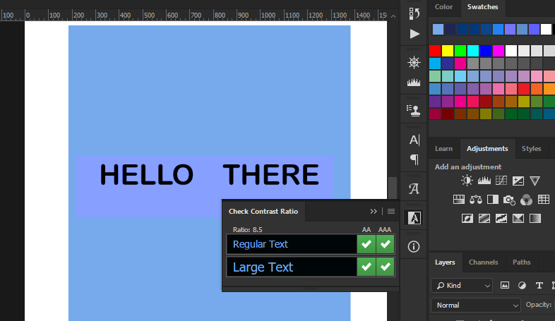
Design Tip:
I tried the Plugin ‘Check Contrast Ratio’ in my 2018 Photoshop program and it did most of the work for me. See image below, the tool checks if your text and contrast complies with the level of regulation your department requires (A, AA, or AAA WCAG compliance). I haven’t checked for updates, but I’d highly recommend it.
.
7. Optimise and scale to your platform
For web display, you only need to use RBG color and 72 ppi for optimal resolution (points per pixel vs. 300 dots per ink when printing) — and your display will load heaps faster. Anyone who follows dashboard analytics on a website will tell you that you’ll be lucky if someone lands on your page for more than 2-3 seconds, so fast loading time is a must.
You can easily add multiple ‘break points’ to your design code if you would like to display imagery on multiple devices. Bootstrapping is not specific to infographics, but you may want to consider implementing Responsive Design within your projects for more versatile outcomes in the future. This means you can pin infographic items separately for relative scalability according to various screen sizes of the devices they will be displayed on.
8. Use Font & Typography Best Practise Design
You can take the guesswork out of Font and Typography for optimal viewing, accessibility and reading speed by following scientific principles. For example, there’s a difference between Serif and Sans Serif fonts according to their display scale when shown on a screen. The light shines through them in different ways, resulting in varying eye fatigue onset times.
Rather than trying to sift through the infinite fonts and styles, here’s what I recommend, if you’re getting started with UX design as part of your infographic work. Calculate the optimal size of your font according to basic trigonometry principles (rather than by font or graphic), based on where the standard eye distance to screen should be for a given device.
For optimal reading times, it turns out that font size should roughly be 10 and when using a scale below that you should always defer to a Sans Serif font, as a rule of thumb.
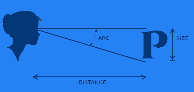
Optimal Reading Scale: 8-12 point, for standard screen distance