'Painting' the United Nations Declaration of Human Rights

                  I've been learning how file formats work, and I'm interested in how information can be embedded into documents without our awareness. A really interesting technique I recently discovered was Steganography, where text or images can be interlaced into the bits of each pixel in another image and the data can be held there while still remaining below the visual threshold of detection (i.e. the human eye may only be sensitive to, say no less that 5 bits of information per pixel, therefore each pixel with 8 bits of data could have a few strings of digits free to be rewritten). Another interesting technique is to use bicubic resampling of an image to add approximating pixels in as 'noise', which might then be extracted by converting the elements of the file into layers. I'm learning a bit of coding in my spare time to grasp these processes better -- It's all very interesting, however there is a bit more to it than I've described here.

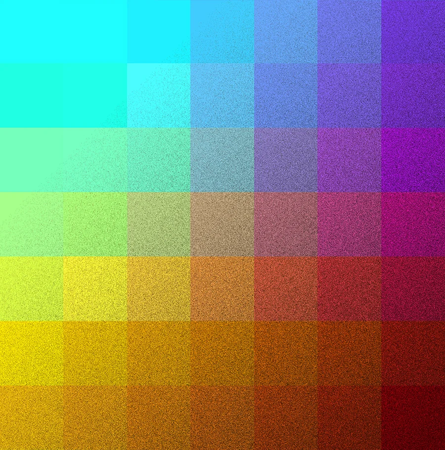
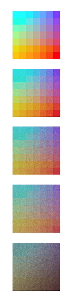
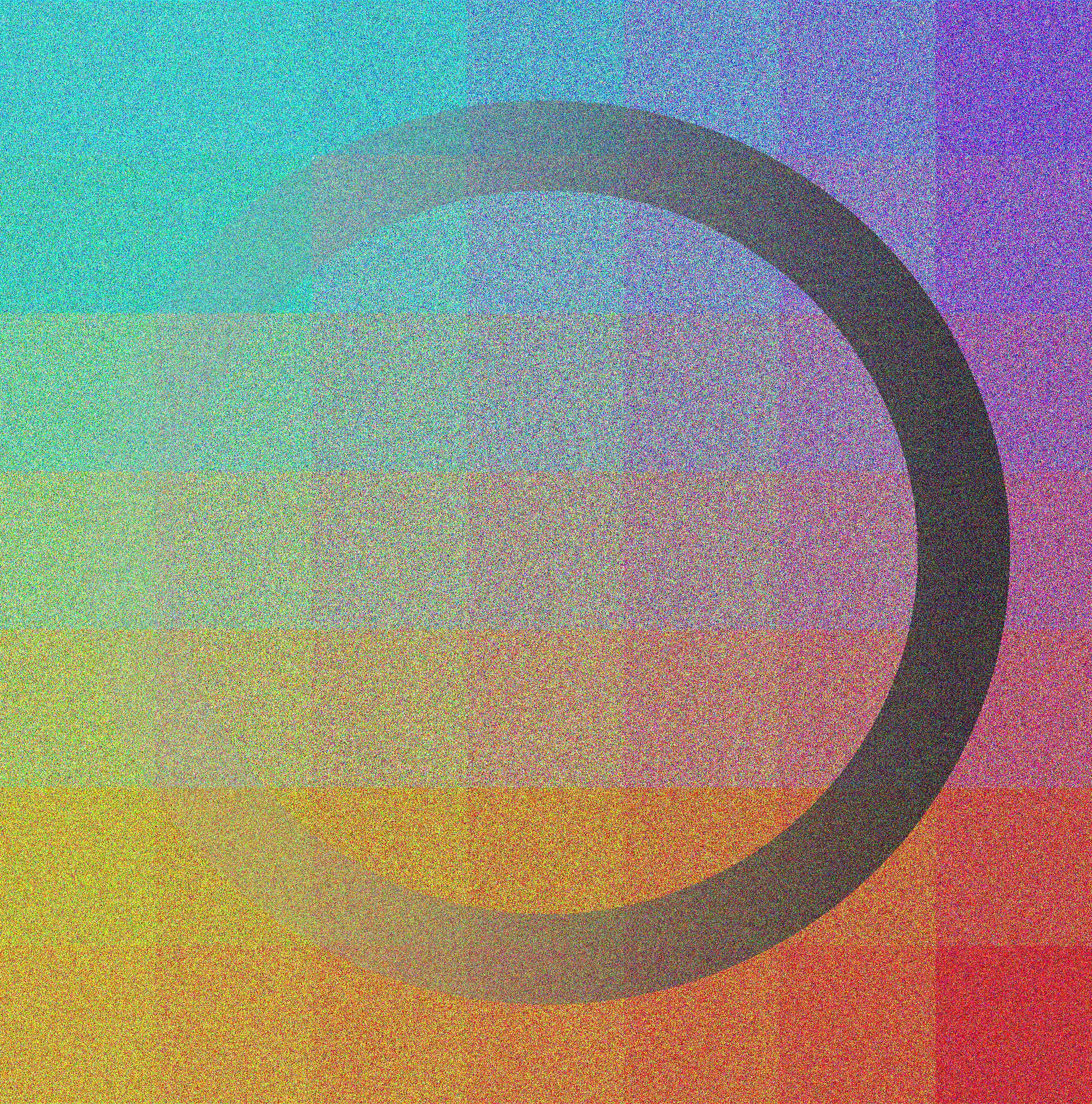
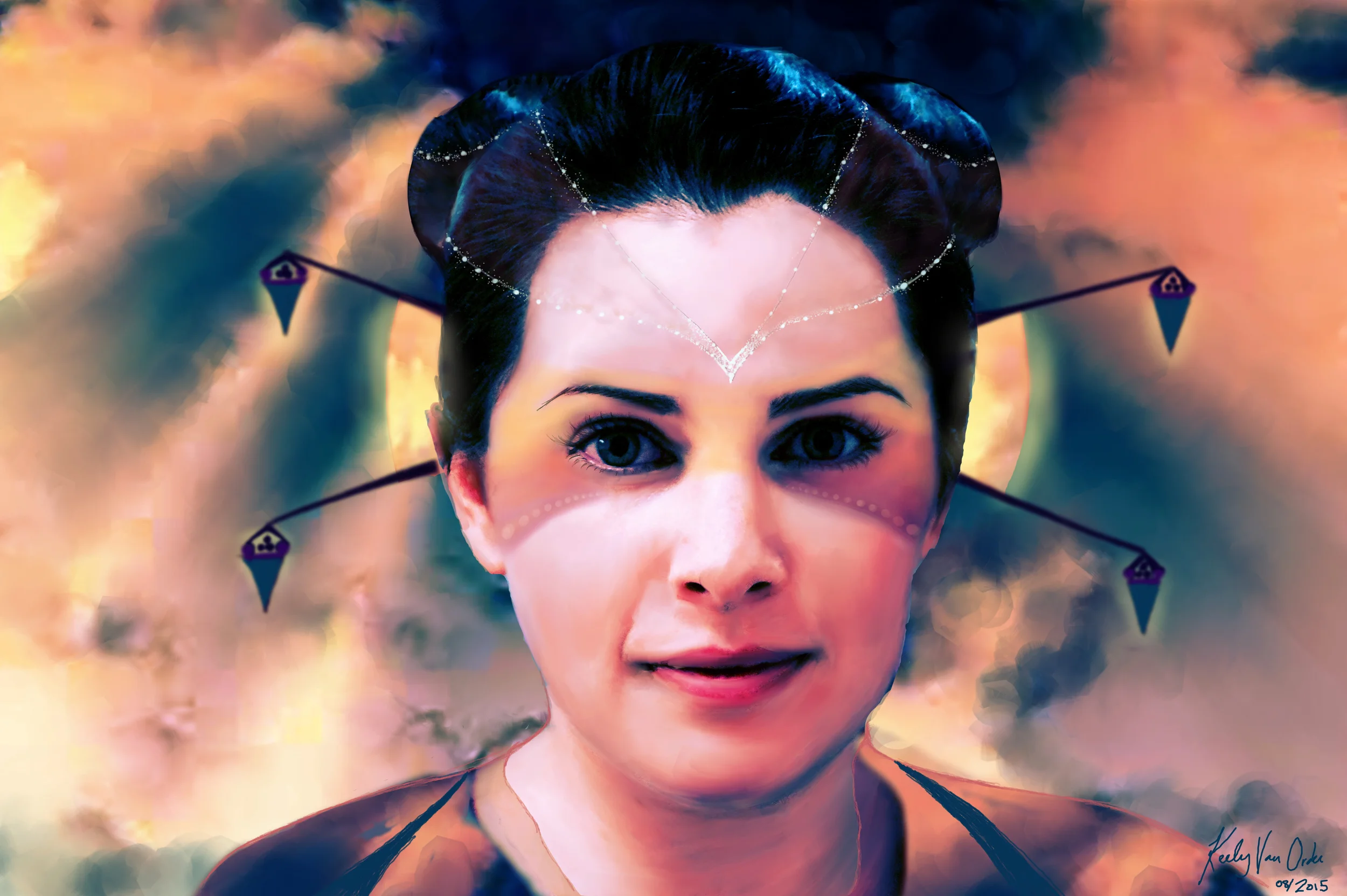
               I've used a simpler technique to 'write' the United Nations Declaration of Human Rights into a piece of artwork. I've done this by converting an abbreviated version of the text into a string of binary digits and then, converting it into a black and white image (where a 0 digit might be white, and a 1 digit might be black). I've then mapped a painting I have made onto the binary display, and the result is that I have converted the UN Declaration of Human Rights into art. Human Rights are a topic which deserve much greater attention and time, particularly in our current world and with respect to the technological revolution we are experiencing. Like most artists I'm passionate about human rights and freedom of expression; this is perhaps my way of contributing to the discussion. If you're not concerned about your rights -- and the rights of others, you really should be...

I'll leave it at that.

Variations in Magenta...

Variations in Magenta...

Variations in Yellow...

Variations in Yellow...

Variations in Blue...

Variations in Blue...

Variations in Red...

Variations in Red...

Experimenting with Lateral Inhibition to make Perceptual Illusions

              I've often wondered how the visual system impacts the processing of images (for example, how do colorblind, or dichromatic people perceive a colorful painting?). I thought I'd experiment with some overlapping gradients, contrast and spatial relations to better understand the topography of the retina.

              When retinal neurons take in a scene, light will excite them into action potentials; cells will fire in particular areas, and those excited neurons will actively block any spreading action to their 'nearest neighbors' in a process called Lateral Inhibition. I thought this was interesting. This can mean that particular areas falsely appear darker or lighter than they actually are. I thought it was interesting that the corner dots in these pictures appear to have a slight brown tinge due to the darker gradient behind them, even though they are in fact all identical. Just a bit of fun and a reminder that our perceptions are not infallible =).

Lateral Inhibition 1

Lateral Inhibition 1

Lateral Inhibition 2

Lateral Inhibition 2

Visualizing Memory as Color

A few months ago, I stumbled on a seminal mathematical model for human long-term memory called the Sparse Distributed Memory by Pentti Kanerva and I was really struck by how much sense it made. Since then, I've been thinking about how information is encoded and how to visualize it so to better understand it.

Memories become physical representations, or engram 'traces' stored in neurons and they naturally decay over time. It helped me to think of a visual memory in a topographical way, where an image was represented by bits that would erode into some other state or color.  An analogy for this could be extraneous noise or static drowning out a signal once it exceeds a critical threshold.   

I was also struck by the discovery of how biased individual perception and attention seems to be -- not only are we conditioned by previous experiences and primed to associate things to one another that occur temporally or spatially close together -- but attention is also a limited resource that becomes distorted by what the brain prioritizes to be important -- in a way, our conscious awareness places objects in the environment into a kind of competition with one another for our attention.

I thought it was interesting to think about color matrices as a way to understand these processes. Here are some images that I have been playing around with this weekend for a bit of fun.

Hope you enjoy them!

 Fading Traces of Competing Colors

 Fading Traces of Competing Colors

Memory Decay 

Memory Decay


    Engram Trace

    Engram Trace

Extraneous Noise 1

Extraneous Noise 1

Extraneous Noise 2

Extraneous Noise 2

Extraneous Noise 3

Extraneous Noise 3

Extraneous Noise 4

Extraneous Noise 4

Extraneous Noise 5

Extraneous Noise 5

Experimenting with the 'Moiré Effect' on Harmonographic Oscillations

Moiré patterns occur when displaced and overlapping lines of similar or identical structure create an interference effect. A common place to find them are in naturally occurring wave interferences. Here, I have taken some harmonic oscillations that were drawn by gravity and I've overlapped them in various ways to get the Moiré, or 'marbled' effect. The overlapping effect is sometimes also referred to as stereoscopic interference. I think the patterns are really interesting from a visual-perceptual point of view, which is the reason I decided to make these.

Moiré No. 1

Moiré No. 1

Moiré No. 2

Moiré No. 2

Moiré No. 3

Moiré No. 3

Moiré No. 4

Moiré No. 4

Moiré No. 5

Moiré No. 5

Playing around with Rorschach Ink Blots

                  For a week or so, I've been having a little obsession with the Rorschach Ink Blot psychometric test. I just finished a degree in Psychology a few months ago, and I've really had the point driven into me that understanding human behavior is all about statistical analysis and the Scientific Method. 

                  Thinking about the inevitable connections between human psychology and artistic expression, I was struck by how interesting Rorschach patterns really are. Herman Rorschach created this test in the 1920's, which was used for indicating personality dimensions and to identify loose associations in thought disorder -- as measured through the subjective, projective self-disclosure responses subjects gave when looking at the intentionally ambiguous, symmetrical images. In more recent times, the scientific validity of this test has been largely discredited and it has fallen into disfavour by clinical psychologists and scientists in general. From a creative perspective however, they are still deserving of continued interest and consideration.

                  A lesser known fact about the ink blot is that Leonardo Da Vinci (and other artists) also experimented with them centuries prior to Rorschach. Da Vinci made the observation that one should stare into stains and other random markings in order to make original associations and develop creative ideas. Later in the 1850's, a popular game called 'Blotto' also prompted players to create and interpret random shapes in a similar way.

                  In a broad sense, the true litmus test of all art is its ability to invoke a personal response in another human being -- When looking at a painting we ask ourselves, What do we see here and what does it make us think?  So, from a creative perspective the Rorschach ink blots are kind of a synthesis of what visual art is essentially meant to do. And even from a philosophical standpoint, it's worth noting that all kinds of symmetries have been found in many scientific, philosophical and artistic fields as indicators of underlying universal truths -- symmetries are aesthetically interesting and meaningful.

                In any case, here is a selection from a few dozen I put together this weekend -- taking a bit of creative license with the use of color. I found the process of making them really interesting and cathartic. I hope you enjoy them from an artistic perspective and that you might also see some patterns and ideas from within your own psyche, mirrored in them!


Blotto Painting No. 1

Blotto Painting No. 1

Blotto Painting No. 2

Blotto Painting No. 2

Blotto Painting No. 3

Blotto Painting No. 3

Blotto Painting No. 4

Blotto Painting No. 4

Blotto Painting No. 5

Blotto Painting No. 5

Blotto Painting No. 6  Read more about the 'deliberate accident' and the history of the ink blot in this excellent piece from The Tate: Click Here  

Blotto Painting No. 6


Read more about the 'deliberate accident' and the history of the ink blot in this excellent piece from The Tate: Click Here


The Grief Hole Illustrated -- February 2017 Publication

The Grief Hole by Kaaron Warren has now been launched and is receiving great reviews -- Kaaron is a very talented writer and it has been a great opportunity working with her and IFWG publishing.

I have now mostly finished with the illustrations for The Grief Hole Illustrated and I am working on the final layouts for the book. We are aiming to have it published sometime in late November. The book contains sketches, illustrations and notes explaining my working process while illustrating Kaaron's book. It is my first major publication, so I am very excited for November. 

It is also such an honour and source of excitement that Nick Stathopoulos, one of Australia's most celebrated artists will be writing a forward for the book -- Nick has recently won the people's choice award Archibald Prize for his incredible portrait, Deng -- an astounding work of art that you absolutely must see if you haven't already.

Looking forward to November!


*** EDIT ***

Book is now scheduled for publication sometime in early 2017... =)

Kaaron Warren's "The Grief Hole" -- Launch August 27

It has been a fun couple of months working on the cover design and illustrated internals for Kaaron Warren's supernatural horror novel The Grief Hole. The book has now been sent to print and the launch has been scheduled to happen during the Canberra Writer's Festival on August 27th. The event will be hosted at the Australian National Library. Here is the link to the event:

The Grief Hole Launch

I will be illustrating at the event and there will be selected artworks given away. Also, I'll be selling limited edition prints at the National Library Bookstore, so please do drop by and have a look if you are interested in purchasing artwork. My full color, 75 page artist's book of illustrations to accompany the novel will be published later in the year.

It certainly promises to be a great event with a bit of intrigue too - hope to see you there!

I'm Publishing My First Book!

Last month I began working with IFWG Publishing Australia to design the cover and illustrate writer Kaaron Warren's upcoming novel The Grief Hole.  Kaaron's book will launch in Canberra, A.C.T. on August 27th 2016 at the Canberra Writer's Centre during the 2016 Canberra Writer's Festival -- this has been such a thrilling project to work on, with Kaaron's writing talent and the publishing expertise of Gerry Huntman at IFWG -- I can't wait to see the launch of the finished book later this year!

In addition to this, I am currently negotiating with IFWG to publish a separate book of my own illustrations and sketches to accompany The Grief Hole.  I will be putting the book together from illustrations to design work and layout -- making this my first officially published creative work. Adding to the excitement, the book will open with a forward from one of Australia's most celebrated artists, to be announced shortly.

Both books are tentatively scheduled to launch in August at the Writer's Festival, so stay tuned and hope to see you there!

Vesper: Notes from an Interstellar Medium

While I've had to put some of my larger creative projects on hold while studying Psychology full time, I have been working on a small book, which I'm excited to be publishing in August.

Seasonal Crown Cover.jpg

Vesper -- Notes from an Interstellar Medium is a collection of poems, sketches and musings on themes of alchemy, metaphysics and pagansim, in the spirit of good humor. I'll be selling the book at local Canberra alternative bookstores as well as at a few places in Melbourne and Sydney, and as an ebook. I'll get some links up once the work has gone to print.

Cheers Dears!

Student Artwork Group Publication

In light of the number of extraordinarily talented students turning up for classes, I am currently negotiating with the Canberra Institute of Technology whether we might publish a small bi-annual anthology of creative works to be sold locally. If you are a current or former student reading this with an interest for showcasing your art, by all means get in touch!

This would be a great opportunity for aspiring artists to get their work seen in print.

The project is still in the works, so stay posted for now =).